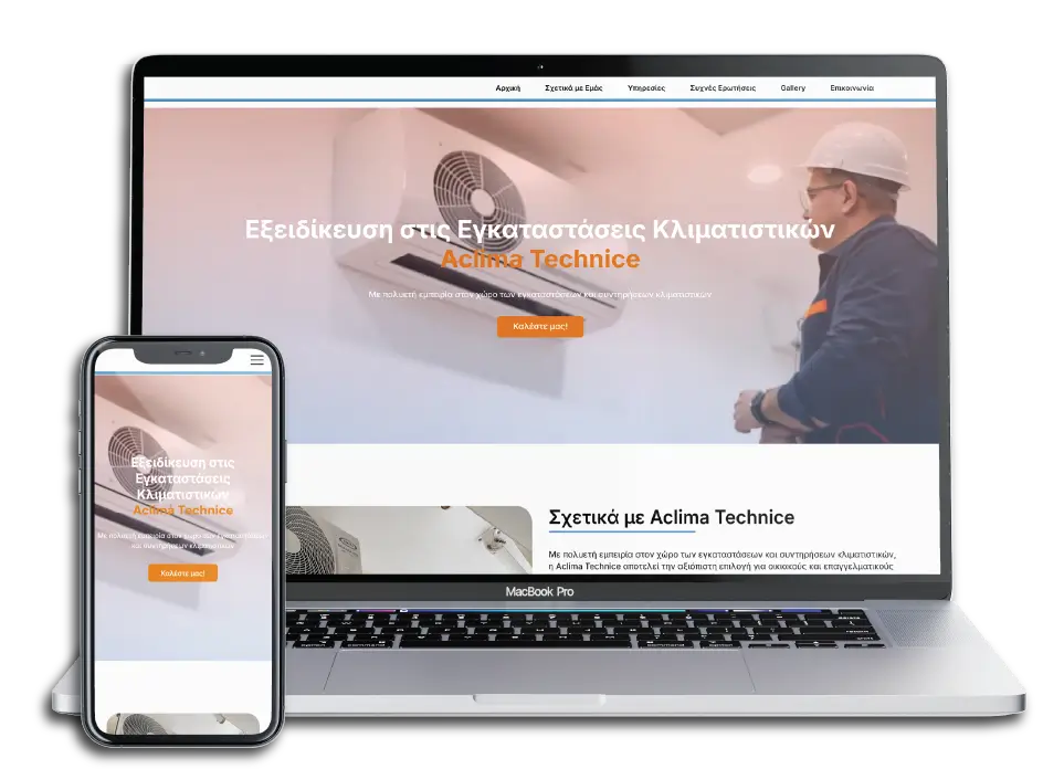
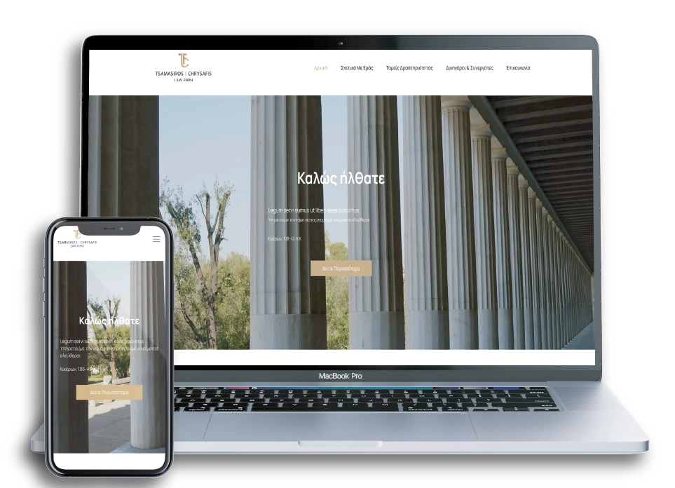
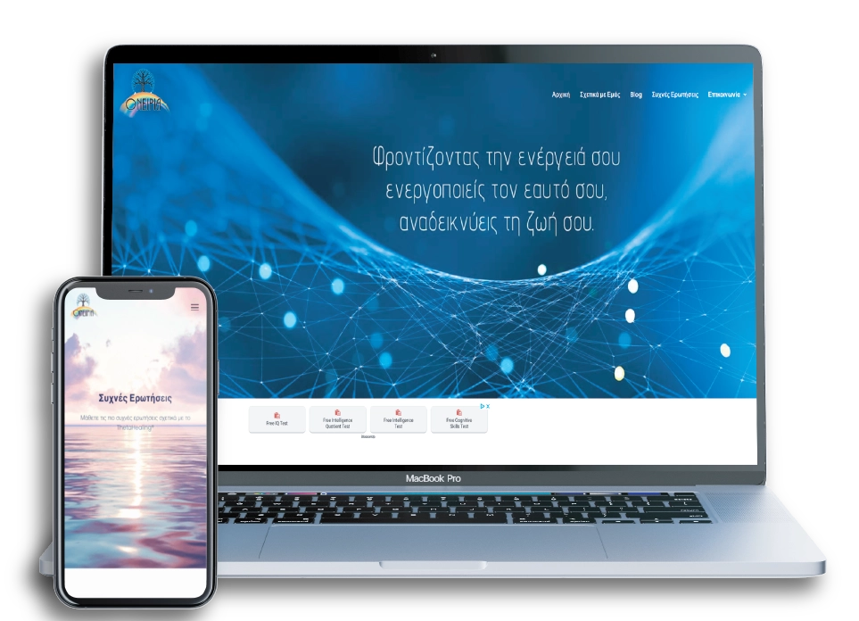
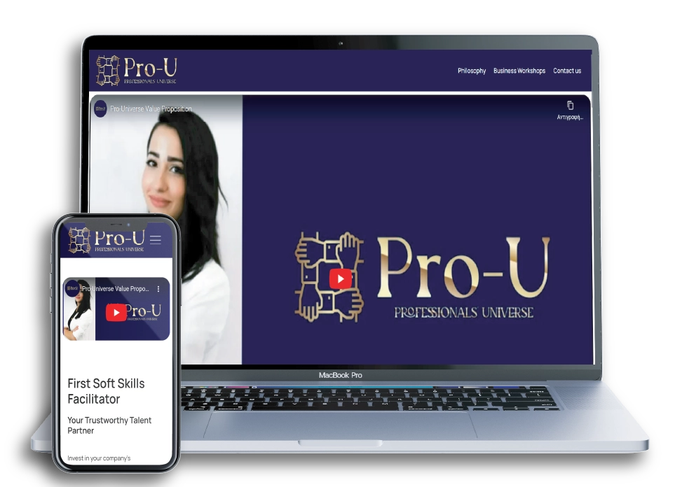
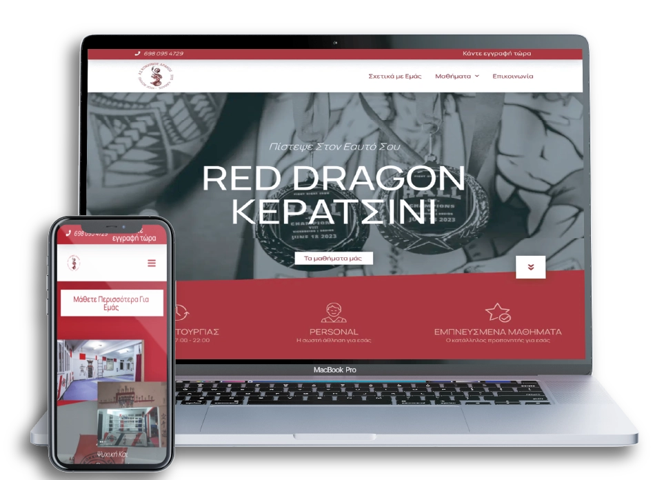
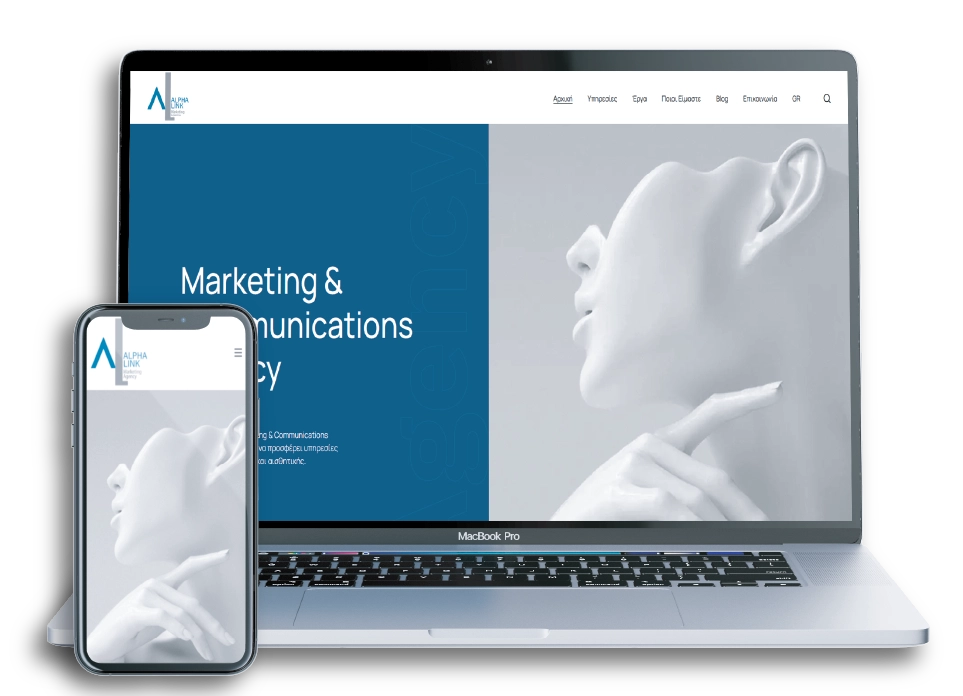
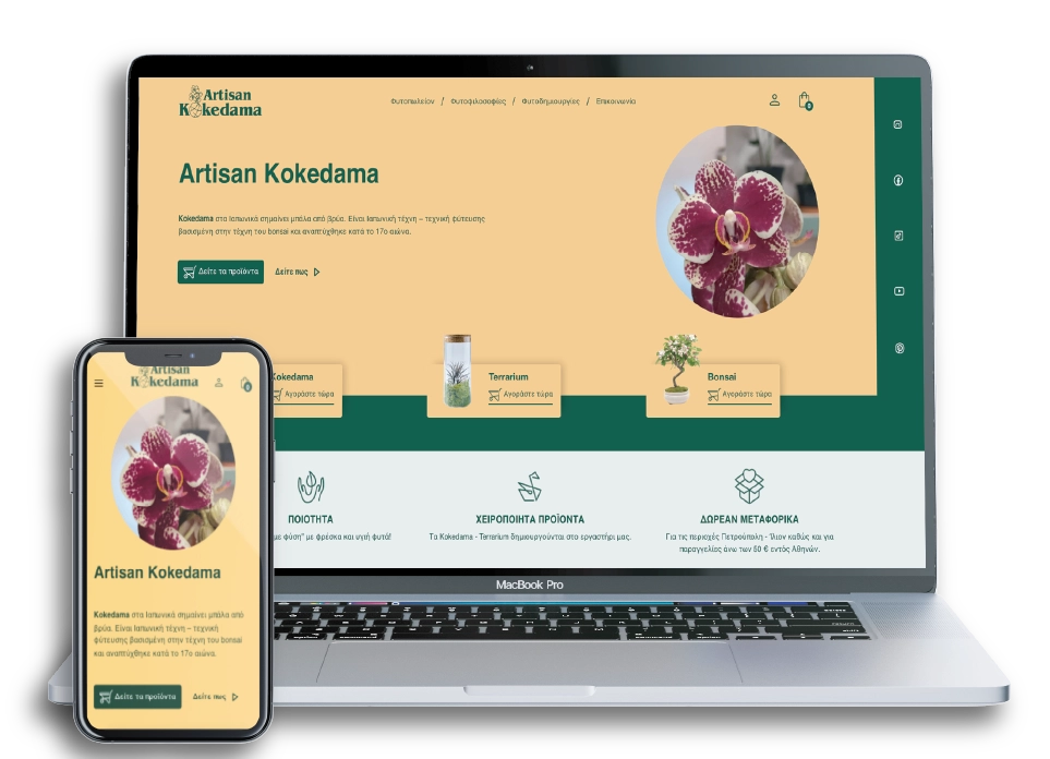
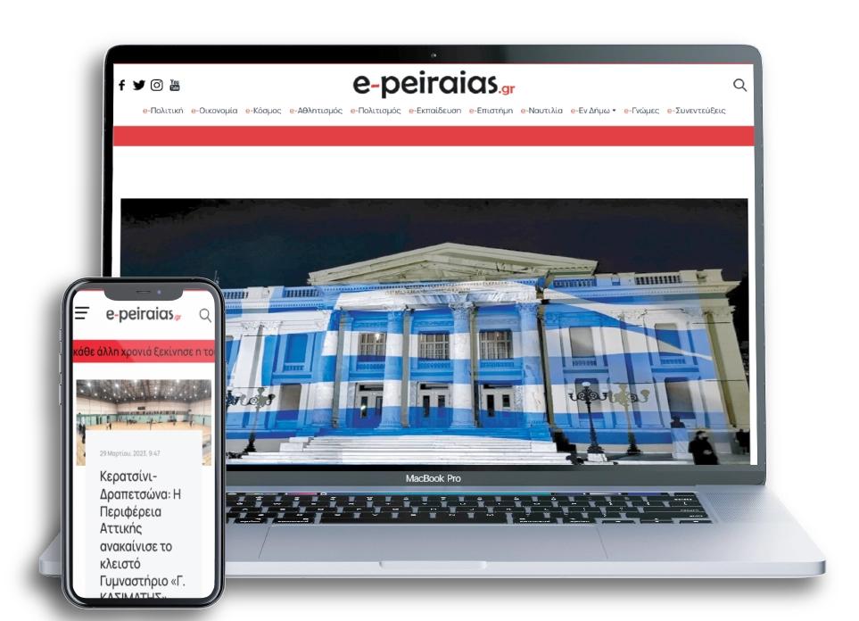
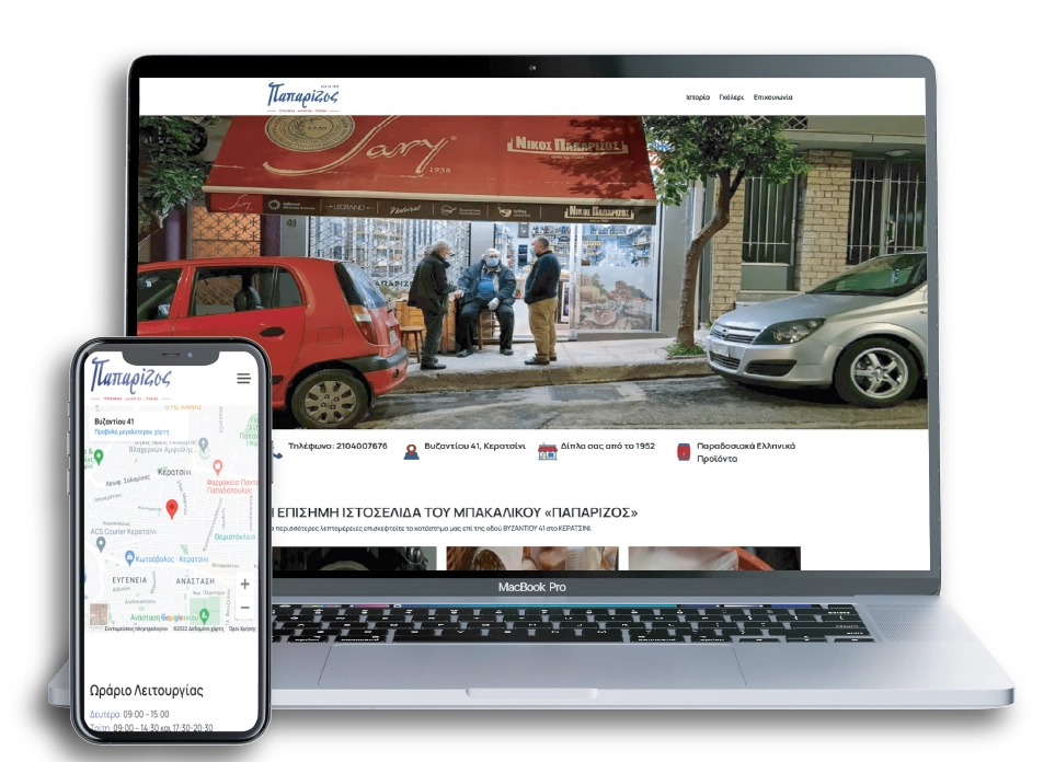
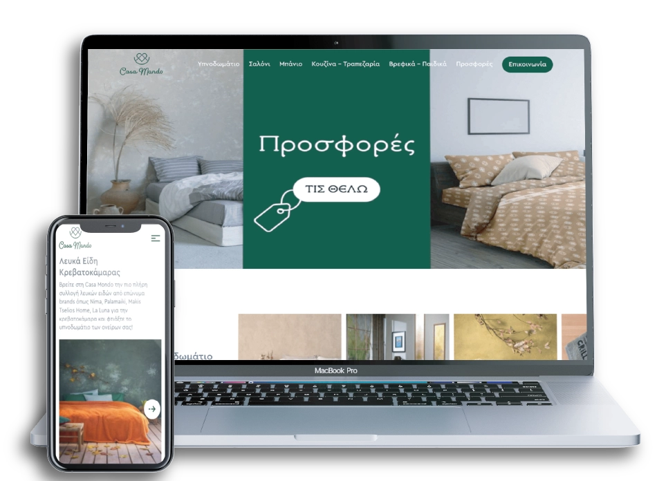
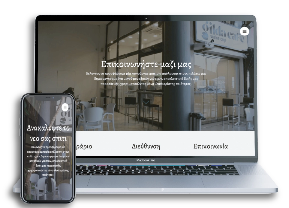
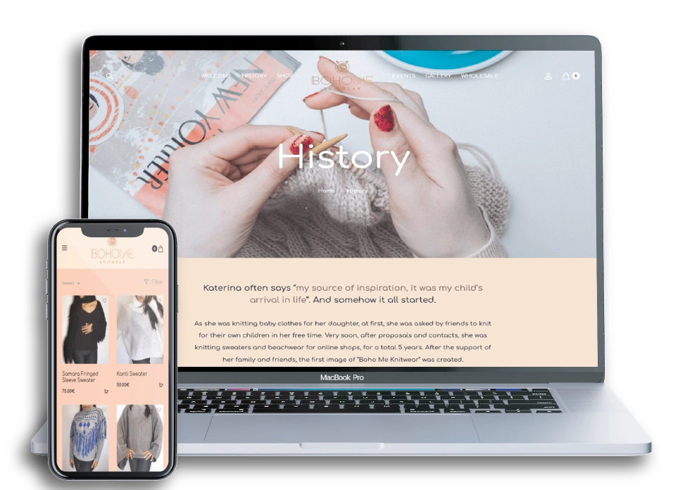
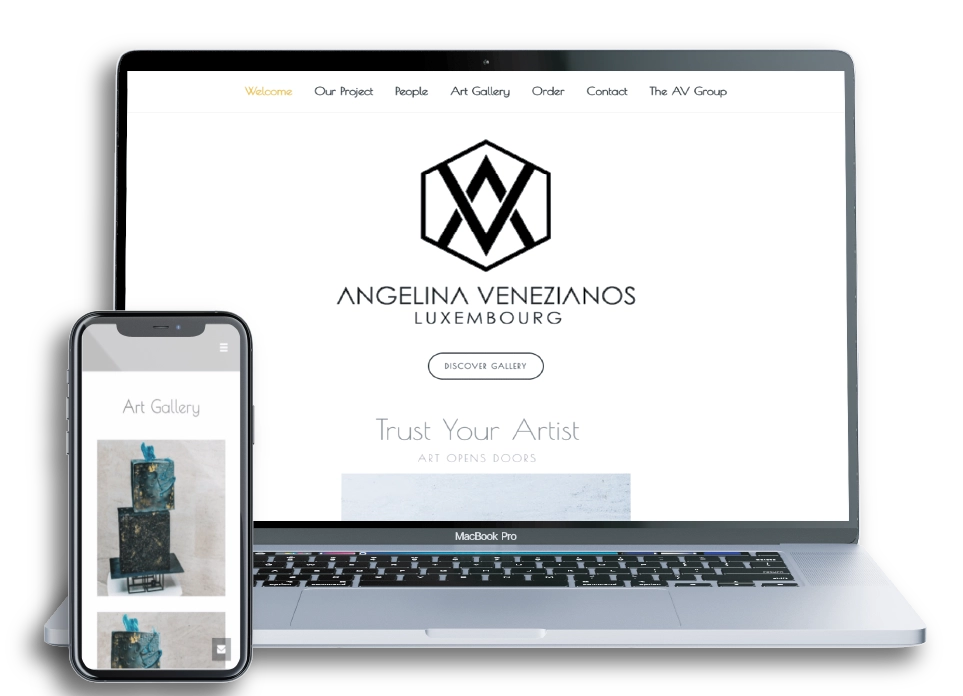
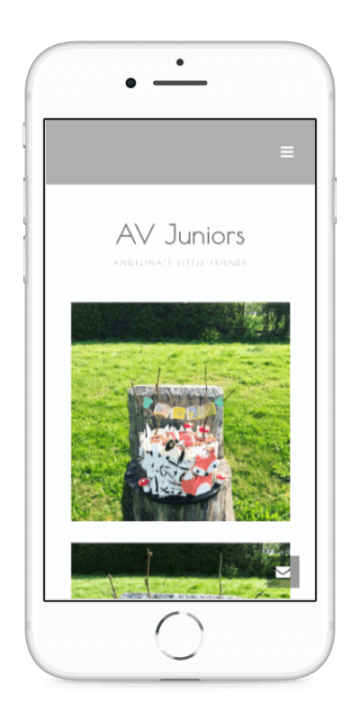
Web Design
We are Web Design Studio in Athens, we specialise in creating, unique and ease of use, websites.
UI/UX, Wireframes, Research and Development - we understand all areas of Web Design. We tranform a start-up business from nothing to a fully functioning brand online. We can revamp an existing brand, or take a successful brand to the next level. We offer web design services to all types of businesses, anywhere around the world. Our talented and creative Web Designer will always be in cooperation with you in order to create a site that reflects your brand, talks to your audience with meaning and personality, and has great functionality across latest devices.
Build
We partner with brands to build new platforms which further their business.
Build engagements depends on the project.
Grow
We partner with fast-growing brands, managing multiple objectives, to help achieve their goals.
These engagements scale up and down, month-to-month based on need.
Support
We're a reliable resource for brands who need assistance maintaining their web presence.
Support engagements are typically a minimum of 1 year.

We approach every project
with one clear vision.
We like to remove the 'waffle' and design beautiful, easy to use websites that are functional.


Browse more services

Web Development
Good design and development work side-by-side. We develop fast, user-friendly and responsive websites that help you reach your business goals effectively.

Digital Marketing
We can help you to set your strategy and make more of your budget. Our target is to achieve the best possible results in such a competitive world market and at the same time to offer you any kind of support, whenever you need it.

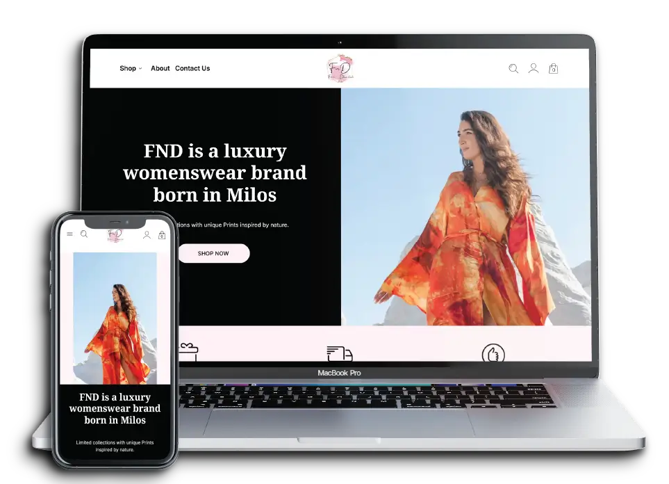
E-Commerce
We build secure, reliable, great-looking e-commerce websites, we use responsive web design to create online storefronts that look just as good on phones and tablets as they do on a desktop.

Let's Start Something New
You’re dreaming of to enhance your online presence? Do not hesitate to contact us.
Let's do this