


Can a website be impressive and hard to use at the same time? Of course.
It can have outstanding animations, distinctive typography, premium photography and a design that grabs attention from the very first second. And yet the visitor may still be unable to work out what the company offers or how to get in touch.
This is the essential difference between “it looks good” and “it works properly”. And that is exactly where UI and UX meet.
1. What is UI and what is UX?
The two terms are often used together, but they do not mean quite the same thing.
UI — User Interface is the visual side of the interface: colours, typography, buttons, cards, icons, imagery, spacing, forms and, more broadly, the way the digital environment is presented.
UX — User Experience is the experience a person has when using that environment. Can they easily tell where they are? Do they find what they are looking for? Do they understand what to do next? Do they feel confident when filling in a form or making a purchase?
UI is what they see. UX is what they experience.
2. Design starts with the user, not the designer
A common mistake is designing based on what we like ourselves. But the designer is not necessarily the end user.
A website for a law firm has a different audience from a fashion e-shop. A B2B platform has different needs from a hotel website. An application used every day by employees has different requirements from a landing page for an advertising campaign.
Before any design work, we need to know who will use the product, why they will use it, what they want to achieve, what information they need and what obstacles they may encounter.
3. The first few seconds matter
When someone opens a website, they should not have to solve a puzzle. They should be able to understand fairly quickly: Which company is this? What does it offer? Why is it relevant to me? What is the next step?
If the hero section is impressive but answers none of these questions, clarity has been sacrificed for aesthetics.
4. Visual hierarchy: not everything is equally important
If everything is big, nothing is big. If everything is brightly coloured, nothing stands out.
Visual hierarchy helps users understand which information they should see first, second and third. We use size, font weight, colour, contrast, whitespace, positioning and grouping to guide attention naturally.
5. Whitespace is not wasted space
There is often a tendency to fill every available spot on a page. But empty space is part of the design. It gives content room to breathe, creates groups of information, reinforces hierarchy and makes the experience more comfortable.
The goal is not to use every pixel. It is to use the user’s attention wisely.
6. Navigation: users should not have to think about where things are
A creative menu may look impressive. But if users do not understand how it works, we have created a problem.
Users have already learnt specific patterns from thousands of websites and applications. There is no need to reinvent every interaction. Innovation is valuable when it improves the experience, not when it forces users to relearn how a website works.
7. Calls-to-action need a purpose
“Learn more”, “Click here”, “See more”. We see them everywhere.
A CTA should explain, as far as possible, what is about to happen: Request a quote. Book an appointment. View the available packages. Add to basket. Start the assessment.
The clearer the action, the less uncertainty we create for the user.
8. Mobile UX: we do not simply shrink the desktop
Mobile design calls for different decisions. There is less space, interaction happens with a finger and the user may be on the move.
We need to consider touch targets, content length, sticky actions, menu structure, forms, modals, typography and speed. Responsive design does not simply mean it “doesn’t break on mobile”. It means it works properly on mobile.
9. Forms are UX
A contact form may seem like an insignificant part of a website, until it asks for 15 pieces of information from someone who simply wants to ask a question.
Every additional field needs a reason to exist. Labels should be clear, errors should explain what went wrong and users should know that their submission has gone through. The same applies to registration, checkout, booking and any process that requires data.
10. Microinteractions: the small details that make an interface “speak”
Did you press the button? Has it saved? Is it loading? Did the payment go through? Was there an error?
Microinteractions provide feedback. They can be a subtle change to a button, a loading state, a confirmation message or a discreet animation. They do not exist just to make the interface more attractive. They exist to tell users what is happening.
11. Accessibility: good design for more people
Accessibility should not be treated as something that concerns only a very small group of users. Contrast, proper text sizes, keyboard navigation, labels, alt text and a logical content structure can make a digital product easier to use for far more people.
Accessibility should be addressed during design and development, not just as an afterthought fix.
12. Design system: consistency instead of chaos
A button should not have a different style on every page, and no developer should be deciding afresh each time how much spacing to use.
A design system can define typography, colours, buttons, form elements, cards, spacing, icons, components and states. This creates consistency for the user and makes both development and the future evolution of the product more organised.
13. UI/UX and conversion are not opponents
When users understand the product, trust the interface and can easily complete the action they want, we remove obstacles from the process.
That can mean more enquiry forms, more bookings, more purchases, fewer abandoned carts or simply less confusion.
We do not design to “force” users to convert. We design so that we do not get in their way once they have already decided they want to.
14. Data can change the design
Design before launch is based on research, experience and assumptions. After launch, we have something even more important: real users.
Analytics, heatmaps, funnels, feedback and usability observations can reveal areas that do not work as expected. Design should not be considered finished just because it has been published. It can evolve based on data.
15. Why “I like it” is not enough
Design inevitably has a subjective side. But a professional UI/UX project cannot be judged on personal taste alone.
We need to ask: Does it serve the brand? Does it suit the audience? Is it clear? Is it easy to use? Does it lead properly to the key actions? Does it work across different devices? Can it evolve?
“I like it” has value. But “it works” has more.
So, what does good UI/UX actually mean?
It does not mean removing creativity, nor making every website look the same. It means using creativity with purpose.
It means designing an environment that expresses the brand, creates emotion and, at the same time, helps people achieve what they came for.
The best interface is not the one that makes users wonder how difficult it was to design. It is the one that makes what they want to achieve feel easy.
Frequently Asked Questions
What is the difference between UI and UX design?
UI is mainly concerned with the visual and interactive interface of a digital product, while UX covers the user’s overall experience when interacting with it. The two areas are different, but they work best when designed together.
Is UI/UX design needed before development?
In projects that require custom design, it is particularly useful to have resolved key decisions on structure, user flows and interface before full development begins. This can reduce changes and ambiguity during development.
What is a wireframe?
It is a simplified representation of a screen or page, used to organise structure, information and key actions before the focus shifts to the final visual design.
Can the UX of an existing website be improved?
Yes. By assessing the existing experience, analysing usage data and identifying points of friction, targeted changes can be designed without necessarily having to rebuild the entire website.
The DynaWasp approach
At DynaWasp, we treat UI/UX as the link between design, technology and business goals.
We do not start with the question “What can we put on the screen?”. We start with: “What should the person in front of it be able to do easily?”
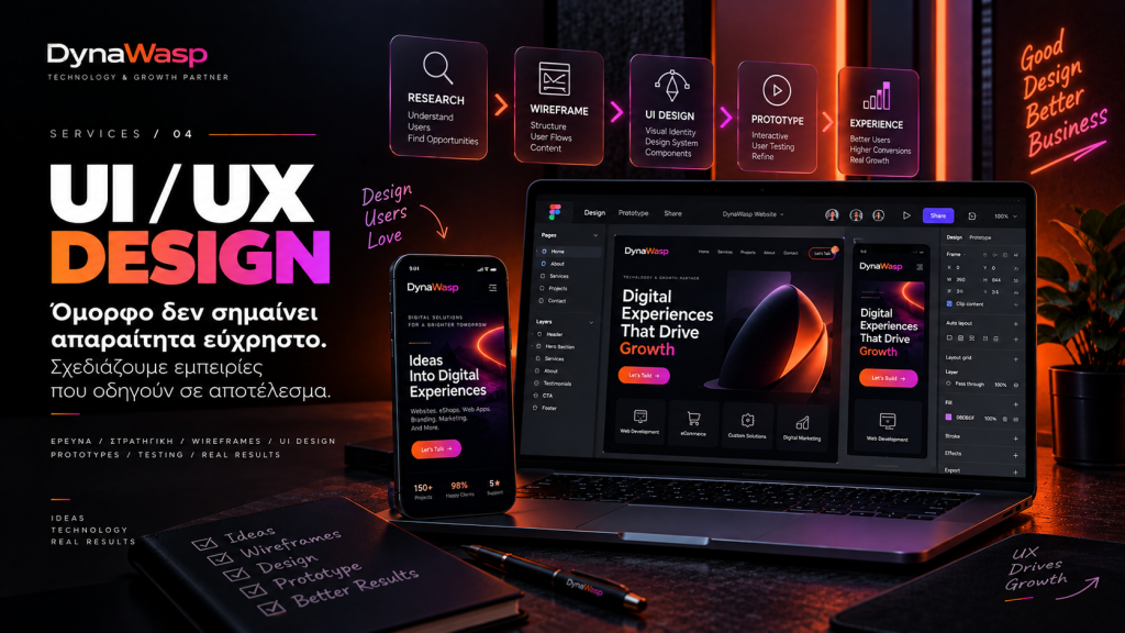
We study the structure, user flows, content, brand and technical requirements before they are turned into a complete interface. Because good design should be beautiful. But first, it has to work.
Planning a new website, e-shop or web application, or feel that your current interface is making life harder for your users? Talk to the DynaWasp team so we can explore how the experience could become clearer, more functional and more effective.